Last week was such a joy in MATS A. Since the market was a familiar one, I wasn't plagued with the same doubts and second guessing that I had in the first two weeks. For the mini, we were to explore tortoises and perhaps letter "The Hare and the Tortoise", so we knew we would be illustrating that story. At first, I had thought we were going to do the cover of the book. But it turned out that we could either do the cover or an interior spread illustrating a scene from the story. I was sooo happy to hear that news. I tend to "choke" slightly with covers, as they are SOO important in children's books. It is the first thing you see, so it has to be really great. Often the editorial department will have the illustrator do the cover early, because they may need it to show the marketing department during their big meeting on deciding which list it goes on, how to market it, etc. So there is a lot riding on it. I find it especially difficult when I am asked to do the cover before I have finished all the interiors! The cover is supposed to give you an idea of the story -- the whole feel of the book, so if I haven't finished all the interiors, it seems premature. Anyway, for these reasons, I was excited to do a double page spread interior, rather than a cover of this classic Aesop fable!
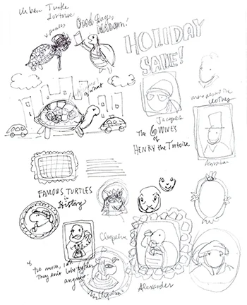
Some more concept doodles...
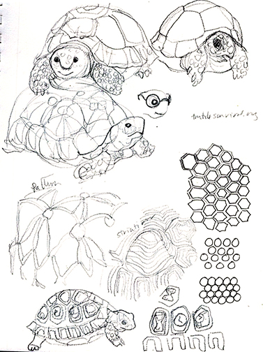
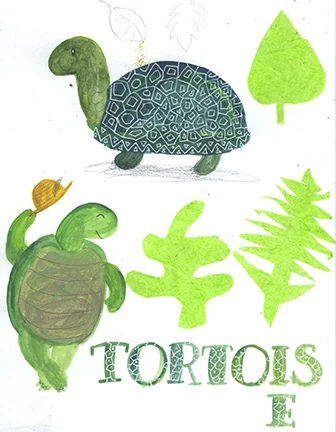
It was fun to just experiment with different paints and techniques while developing the tortoise character.
Some India ink experimentation
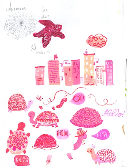
Gouache -- my new favorite "playing around" medium! I chose pink and magenta because it's one of the few colors that is still fresh -- so many others have dried up.... :(
Some acrylic and tissue paper collage with pencil and white gel pen.
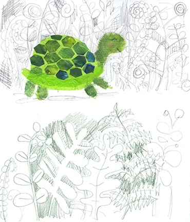
More collage (the design on the shell is from some used palette paper and the little guy's head is paper towel) and pencil
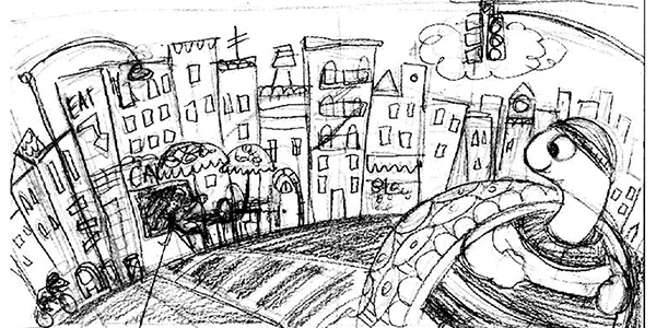
On Wednesday, we got the assignment, and that is when I learned we could do a double page spread! I started with some thumbnails. I knew I wanted to do an urban scene because I had so much fun painting all the buildings (see above), and because I live in Brooklyn, and I love the cityscape. I've been painting a lot of urban scenes every day in my sketchbook also, and last weekend was the NYC Marathon! So all these things added up to me being very excited to do an urban take on the tale.
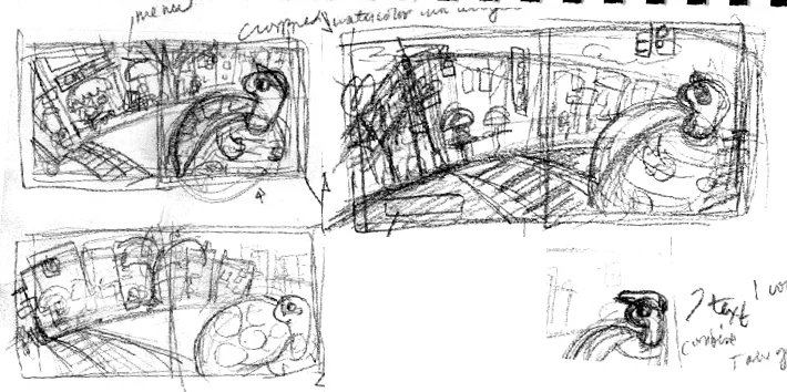
Thumbnail sketches
I then did a mini sketch and used this to figure out my color palette (see below)
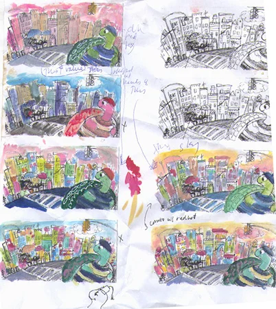
My color studies -- note the doodle of the tortoise with the fez below!
I couldn't decide on the color! I really liked the vibe of the pink and red from my gouache experiments. But I wasn't sure about the pink tortoise. My husband confirmed when he said that it looked like he was sun burned... I was going to go with the sixth version, but then decided to go with the first one in the end (this of course changed later -- nothing's written in stone!)
For the final, I decided to paint the whole background and then assemble like a collage afterwards. I usually don't work this way, but for some reason, it made sense for this one.
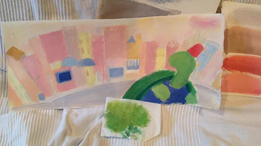
My rough painting with some extra swatches (I didn't end up using), along with a piece of paper towel (Bounty) that I painted on. I liked the texture I got when I was experimenting earlier.
Then I painted a bunch of shapes in black ink and drew in pencil, and scanned the whole lot in -- about eight or nine sheets of vellum!
Then I put everything together in Photoshop. A lot of the buildings I drew in Illustrator, because I was pressed for time. Normally I would have done them by hand, but I did this in two and a half days from thumbnails to finish, so I had to streamline it a bit.
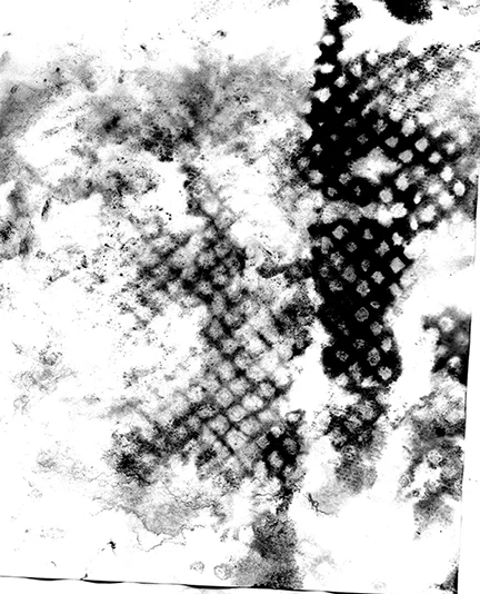
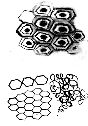
I loved this texture that I accidentally found when I was about to throw out my used palette paper! It's made by the paper towel -- the reverse of the painted paper towel i used for the head. I made it grey scale and increased the contrast and used it as texture on the tortoise's breast plate.
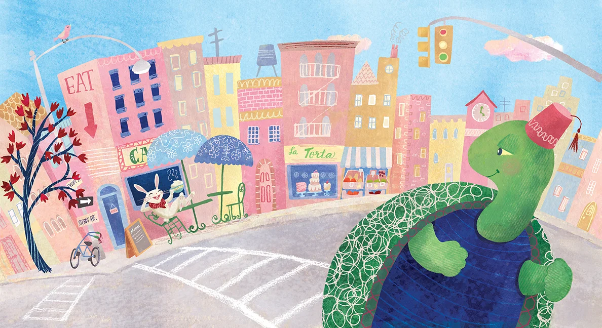
And here is the final illustration. I went with the blue sky in the end. Also, I decided to change the tortoise's eyes to more "sleepy-like" and to give him a fez, like in my early morning doodle of the new head I drew on my color studies. Some of my most inspired ideas come when I'm half awake.
I can't tell you how much fun this was to create. I enjoyed every minute of it, even when my eyes were drooping from exhaustion! I actually had a work deadline to turn in final sketches for a book I'm working on last Friday, so I had a limited time to finish this tortoise one. On the other hand, I don't feel like I would spend more time on it if I had more time. I think I got it to just the place I wanted to... I wanted the background to feel loose with the line, and I didn't want make all the buildings as detailed as La Torta (I liked the closeness of it to "tartaruga" in Italian) and the green market because it would take away from the characters. But I still had so much fun noodling around doing those tiny detailed bits. :)
This week we are starting with Wall Art. So we'll see where that leads.... Hope everyone has a great week! Thanks for stopping by! :)